Decision Support Dashboard for the Director General of Health Services (DGHS)
Sri Lanka
User Guide and Data Management Standard Operating Procedure (SOP)
Version: 1.6 (2025 June)
This version should be reviewed on 30/07/2025
Background:
A digital decision-support dashboard was developed for the Director General of Health Services in Sri Lanka, with support from the Bloomberg Philanthropies Data for Health Initiative and Vital Strategies. This dashboard is to empower the Director General to make informed, data-driven decisions regarding health-related strategies and programs. It achieved this by aggregating data from diverse sources and presenting it through meaningful visualizations.
Purpose of this document:
This document serves as a comprehensive guide to the functionality and utilization of the decision support dashboard for the Director General of Health Services (DGHS) in Sri Lanka. It outlines standard operating procedures (SOP) for data providers and data managers to ensure data quality and consistency.
Therefore, this document has two distinguished parts that guide the decision makers on: 1) the availability of dashboard resources and 2) an SOP for data providers and managers for how the data should be obtained, ingested and transformed to provide meaningful and reliable visuals that decision-makers can rely on. Both parts should be understood by decision-makers, data providers and data managers to understand the challenges, advantages and disadvantages of each aspect and support each other to benefit all.
Guideline for DGHS and his or her staff on Decision-Support Dashboard
Introduction
- Purpose: These guidelines are designed to help the DGHS and his/her supporting staff to effectively utilize the DGHS Decisions-Support Dashboard to gain insights, make informed decisions, and drive organizational performance.
- Scope: This dashboard is specifically designed for DGHS to make decisions on identified areas. Currently, the dashboard contains Medical Supplies, Dengue, Sustainable Development Goals (SDG) and Universal Health Coverage (UHC) information. However, Human Resources Information, Major Project Financial Progress, Major Equipment Utilization Patterns, Disaster Monitoring, and some epidemiological information are designed and will be included in the dashboard once updated data are available.
- Note: It is advisable to read the SOP component of this document in order to get an insight into what kind of indicators and their data sources that contribute to DGHS Decision-Support Dashboard. It is important to understand the strengths and weaknesses of the data and other factors before interpreting the Dashboard visualizations.
Accessing and Navigating the Dashboard
- Access: Please access the dashboard typing http://203.94.76.60/dashboard/ on a web browser either on a computer or mobile phone (this will be modified during the course of rolling out).
- Login: username and password will be provided to you separately by the admin.
- Admin: Dr Kasun Rambukwella is the contact person currently assigned as administrator. Please contact on 0716396628 or email: kasunrambuk@gmail.com
- Navigation: When logged-in successfully the landing page of the Dashboard will appear as follows.
Landing page
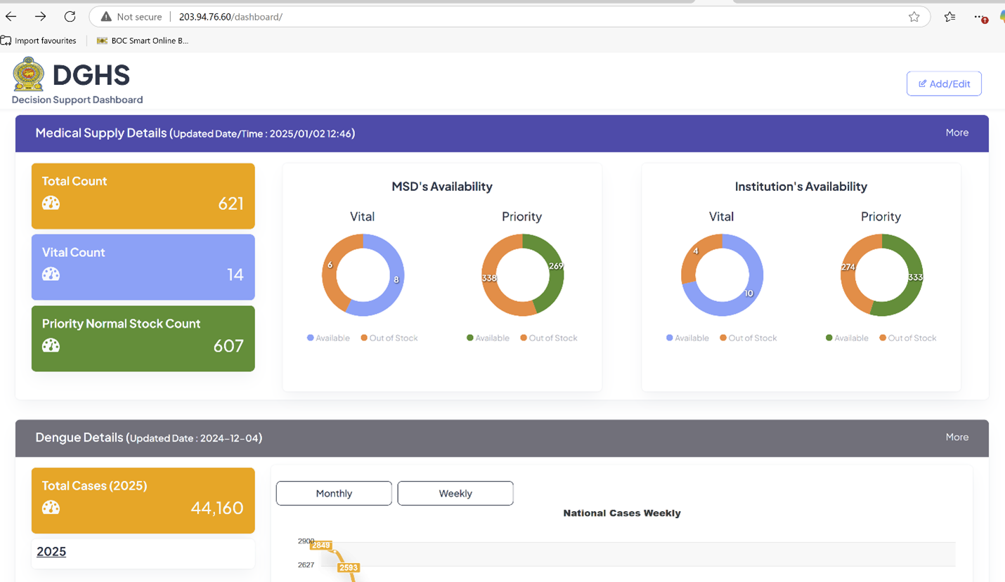
Key Sections: Currently the following distinguished tabs are included in the landing page of the dashboard; Medical Supply details, Dengue details, SDG details and UHC details. Some important Key Performance Indicators (KPI) for each topic are displayed in various visual formats on the landing page. Additional information for each topic can be explored from the landing page, click ‘more’ button at each major tab. The following chapter describes the content available in each detailed view, including the underlying information and navigation information.
Medical Supplies Dashboard
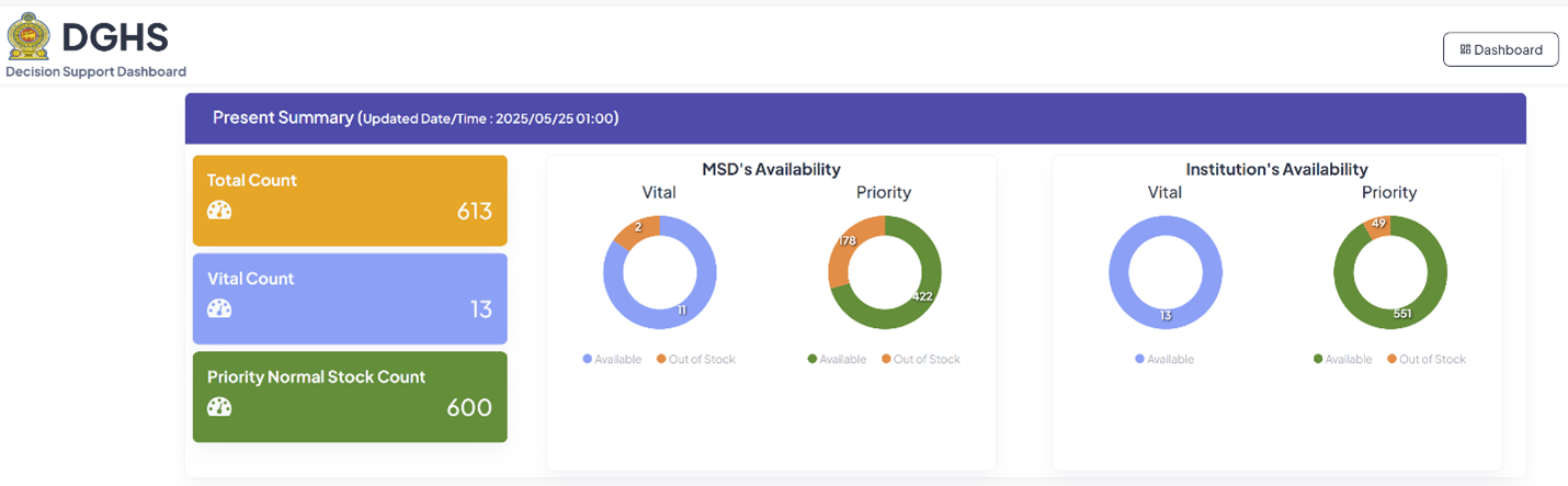
Key Performance Indicators (KPI)
- Total Count of Medical Supplies: This is the overall number of selected medical supply items available (in stock). It provides a general overview of the stock level.
- Vital Count: This KPI tracks the number of selected "vital" medical supplies. These are selected vital medications critical for patient care.
- Priority Normal Stock Count: This KPI refers to the number of non-vital medical supplies that are still considered high priority.
- MSD's Availability (Vital and Priority): This KPI uses pie charts to show the proportion of vital and priority items that are available versus out of stock at the Medical Supplies Division (MSD).
- Institution's Availability (Vital and Priority): Similar to the MSD's availability, these pie charts show the proportion of vital and priority items that are in stock or out of stock at the selected health institutions.
Data Source:
- ‘Swastha System’ of Medical Supplies Division
Type of Data Visualization
- Counts: Simple numerical displays for total, vital, and priority stock counts.
- Pie Charts: Used to represent the proportion of "Available" vs. "Out of Stock" for both vital and priority medical supplies at the MSD and institutions.
- Color Coding:
- Blue – Vital availability
- Green – Priority availability
- Orange – Out of Stock
This dashboard aims to provide a quick and easy-to-understand overview of medical supply availability. The counts and pie charts allow to monitor stock levels and potentially identify shortages of selected vital and priority medical supplies at MSD and selected Institutions.
Medical Supplies Dashboard – Drill down
When ‘more’ is clicked on the Medical Supplies dashboard landing page.
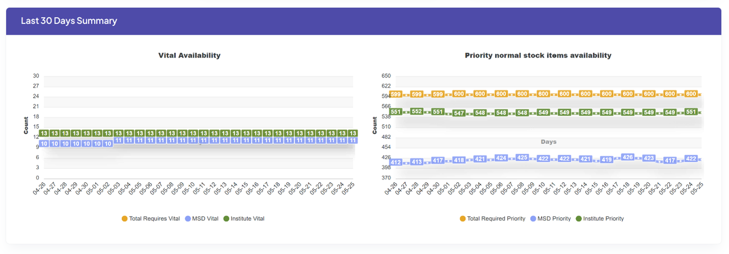
This graph shows the availability of selected medical supplies over a 30-day period.
Key Performance Indicators (KPI)
- Vital Availability: This KPI tracks the availability of selected vital medical supplies for a 30-day period (from the day access to the retrospective 30-day period)
- Priority Normal Stock Items Availability: This KPI tracks the availability of selected priority medical supplies for a 30-day period (from the day access to the retrospective 30-day period).
Type of Data Visualization
- X-axis: Represents the time period (30 days) with dates marked
- Y-axis: Represents the "Count" of medical supplies
- Color Coding:
- Orange - Total Required (Target)
- Blue – Availability at MSD
- Green – Availability at Institutes
Purpose of Visualization
- Monitor Trends: Observe how the availability of vital and priority medical supplies fluctuates over time.
Medical Supplies Dashboard – Drill down 2
This section will be accessed by scrolling down from the previous section.
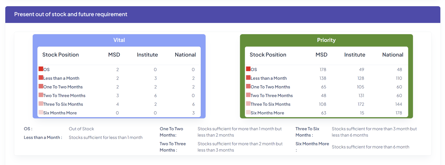
Key Performance Indicators (KPIs)
‘Vital’ Drug table
- OS: At this moment (the day of accessing the dashboard) Out of Stock item at ‘MSD’, ‘Institute’, ‘National’.
- Less than a Month: At the moment (the day of accessing the dashboard) the items in stock for less than a month at ‘MSD’, ‘Institute’, ‘National’.
- One to Two Months: At the moment (the day of accessing the dashboard) the items with stock for one to two months at ‘MSD’, ‘Institute’, ‘National’.
- Two to Three Months: At the moment (the day of accessing the dashboard) the items with stock for two to three months at ‘MSD’, ‘Institute’, ‘National’.
- Three to Six Months: At the moment (the day of accessing the dashboard) the items with stock for three to six months at ‘MSD’, ‘Institute’, ‘National’.
- Six Months More: At the moment (the day of accessing the dashboard) the items with stock for six months or more at ‘MSD’, ‘Institute’, ‘National’.
Example –
In the above table;
- At the moment one item is out of stock at the MSD and no item is out of stock at Institutions or National level.
- There are four items not adequate for next one month, in other words four items will be out of stock within one month at MSD; There are four items not adequate for next one month, in other words four items will be out of stock within one month at Institutions; There are two items not adequate for next one month, in other words two items will be out of stock within one month at National level.
‘Priority’ Drug table
- OS: At this moment Out of Stock item at ‘MSD’, ‘Institute’, ‘National’.
- Less than a Month: At the moment the items with stock for less than a month at ‘MSD’, ‘Institute’, ‘National’.
- One to Two Months: At the moment the items with stock for one to two months at ‘MSD’, ‘Institute’, ‘National’.
- Two to Three Months: At the moment the items with stock for two to three months at ‘MSD’, ‘Institute’, ‘National’.
- Three to Six Months: At the moment the items with stock for three to six months at ‘MSD’, ‘Institute’, ‘National’.
- Six Months More: At the moment the items with stock for six months or more at ‘MSD’, ‘Institute’, ‘National’.
Purpose of the Visualization
- Provide information on current out of stock items and ahead of time warning that the number of items that could go out of stock during the said period according to the calculations.
Medical Supplies Dashboard – Drill down 3
This section will be accessed by scrolling down from the previous section.
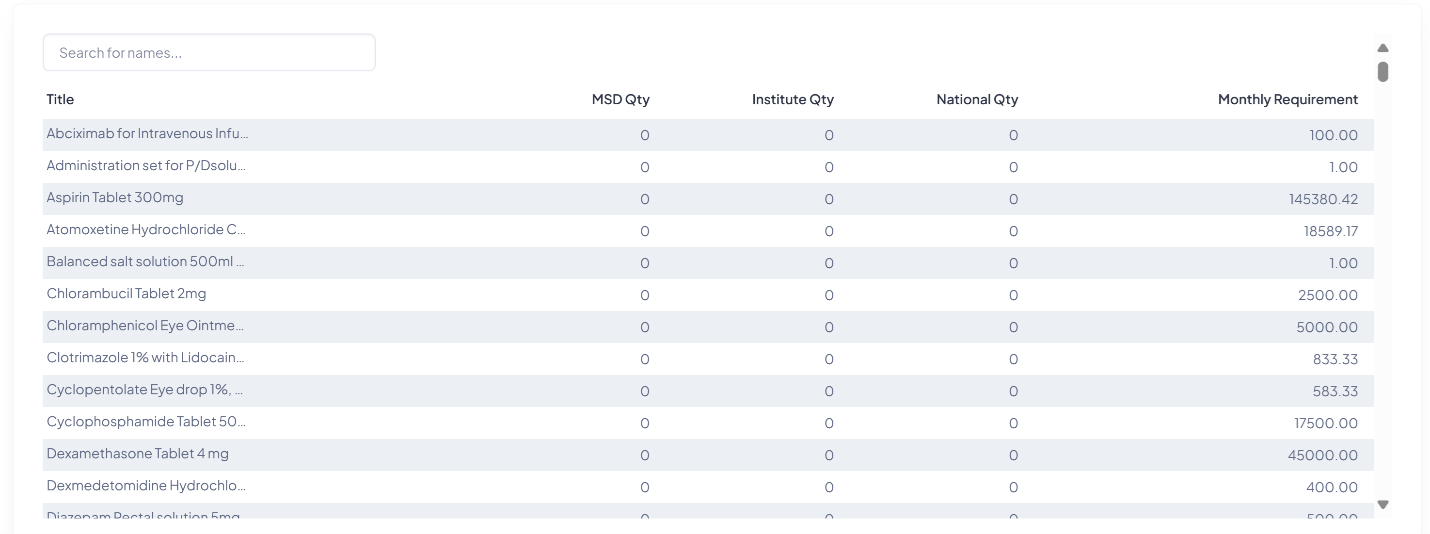
This table shows the current stock levels of individual medical items (selected vital and priority items) at different locations.
Key Performance Indicators (KPI)
- MSD Qty: The quantity of each medical supply item is currently available in the Medical Supplies Division (MSD).
- Institute Qty: The quantity of each medical supply item available at healthcare institutions.
- National Qty: The quantity of each medical supply item available at the national level. It is the sum of MSD and Institutional stock.
- Monthly Requirement: The estimated monthly requirement needed for each medical supply item.
Type of Data Visualization
- This visualization uses a table to present the data.
- Rows: Each row represents a different medical supply item
- Columns: Each column represents MSD Qty, Institute Qty, National Qty, Monthly Requirement
- Search Bar: Allows users to quickly find specific medical supplies items within the table.
Purpose of Visualization
- Provide a Detailed Inventory: Offer a comprehensive overview of the current stock levels for each medical supply.
- Stock Across Locations: Show the distribution of exact number of supplies between the MSD and individual institutions.
- Compare Against Demand: Available quantities with the monthly requirement to identify potential shortages or surpluses.
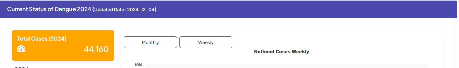
Dengue Dashboard
Dengue Landing Page
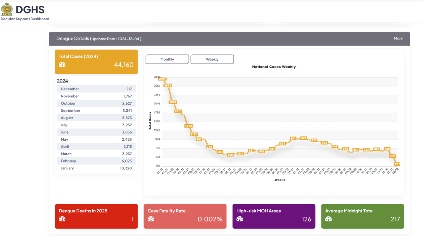
Key Performance Indicators (KPI)
- Total Cases: The overall number of dengue cases recorded in the selected year.
- Monthly Cases: The number of dengue cases reported each month in the selected year (this is shown in the Cases Monthly graph as well).
- Weekly Cases: The number of dengue cases reported each week, shown in the Cases Weekly graph.
- Dengue Deaths: The number of deaths attributed to dengue in the selected year.
- Case Fatality Rate: The percentage of dengue deaths out of total dengue cases reported during the period.
- High-risk MOH Areas: The number of geographical (MOH) areas identified as high-risk areas for dengue.
- Average Midnight Total: The number of dengue patients hospitalized as of midnight.
Data Source:
- ‘Densys’ system of the Dengue Control Unit.
Type of Data Visualization
- Counts: Numerical displays for "Total Cases," "Dengue Deaths," "Case Fatality Rate," "High-risk MOH Areas," and "Average Midnight Total."
- Line Graphs: A line graph for "Weekly National Cases" and a line graph for “Monthly National Cases”.
- Color-Coding:
- Orange – number of dengue cases
Purpose of Visualization
- Tracking the Outbreak: Monitoring trends in dengue cases over time.
- Assessing Severity: Evaluating the severity or treatment outcome of the outbreak by including mortality data and case fatality rate.
- Identifying High-Risk Areas: Highlighting areas requiring focused interventions and resource allocation.
- Monitoring Resource Utilization: Tracking resource utilization (hospital beds) based on the "Average Midnight Total".
Dengue Dashboard - Drill down 1
When ‘more’ is clicked on the Dengue dashboard landing page.
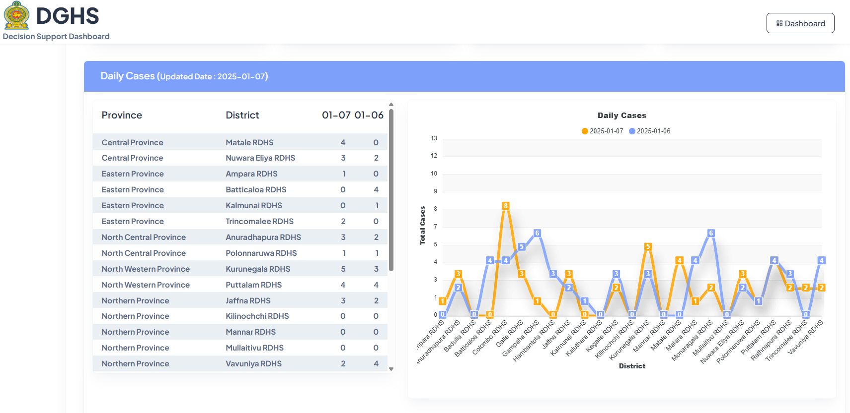
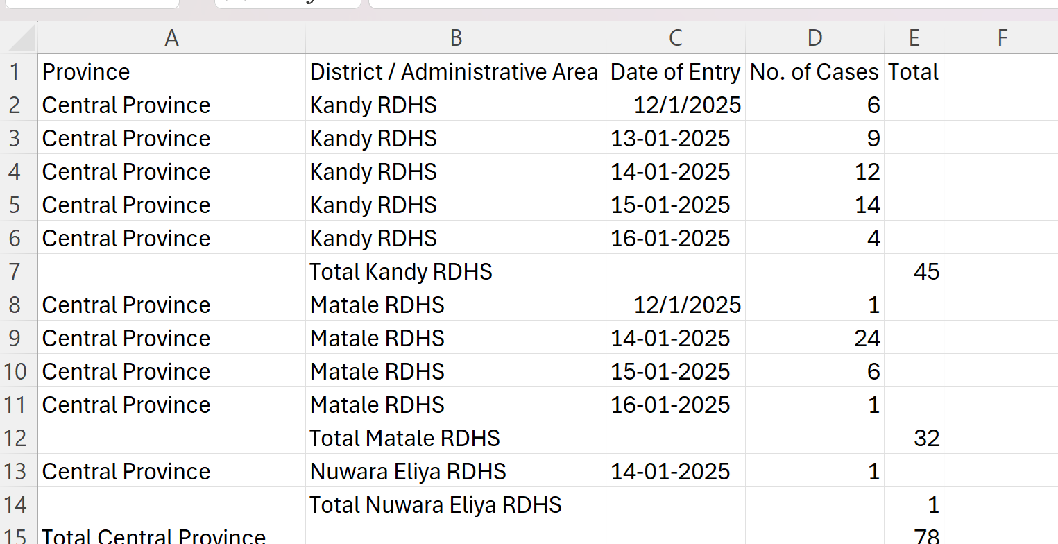
This dashboard tracks daily dengue cases at provincial and RDHS level.
Key Performance Indicators (KPI)
- Daily Cases: The primary KPI here is the number of new dengue cases reported each day in each RDHS area and each Province.
Type of Data Visualization
- Table: A table to present the daily dengue case counts for each district and province on the specified dates.
- Line Diagram: A line chart to visually compare the daily cases across different districts and on different days (last reported date and the day before).
- Color-Coding: Different colors (orange and blue) are used to distinguish between each date.
Purpose of the Visualization
- Monitor Dengue at a Local Level: Track daily dengue cases with a focus on individual districts within each province.
- Identify Hotspots: Quickly identify districts with higher daily case counts, allowing for targeted interventions and resource allocation.
Dengue Dashboard – Drill down 2
This section will be accessed by scrolling down from the previous section.
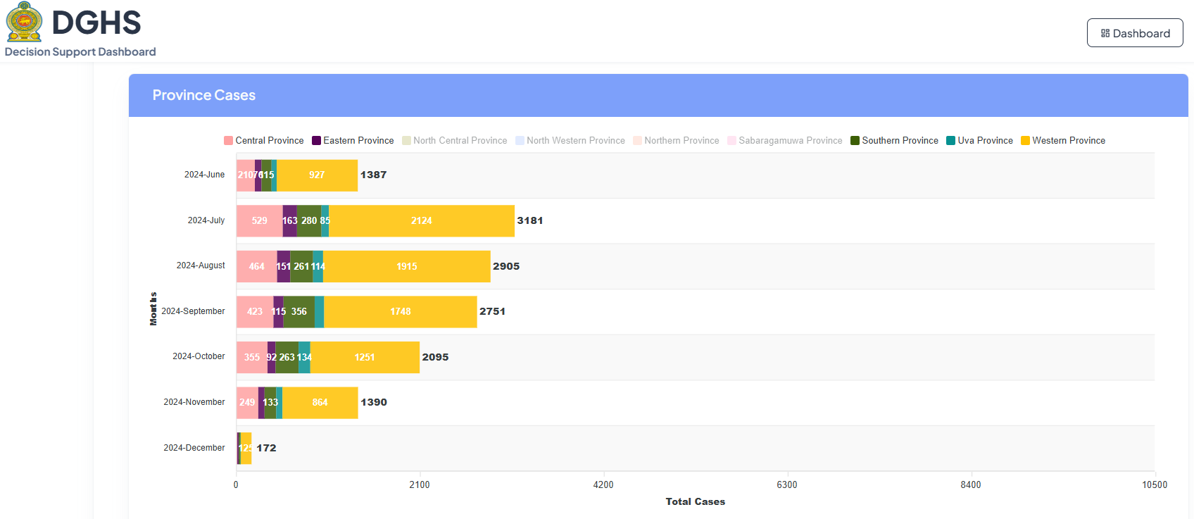
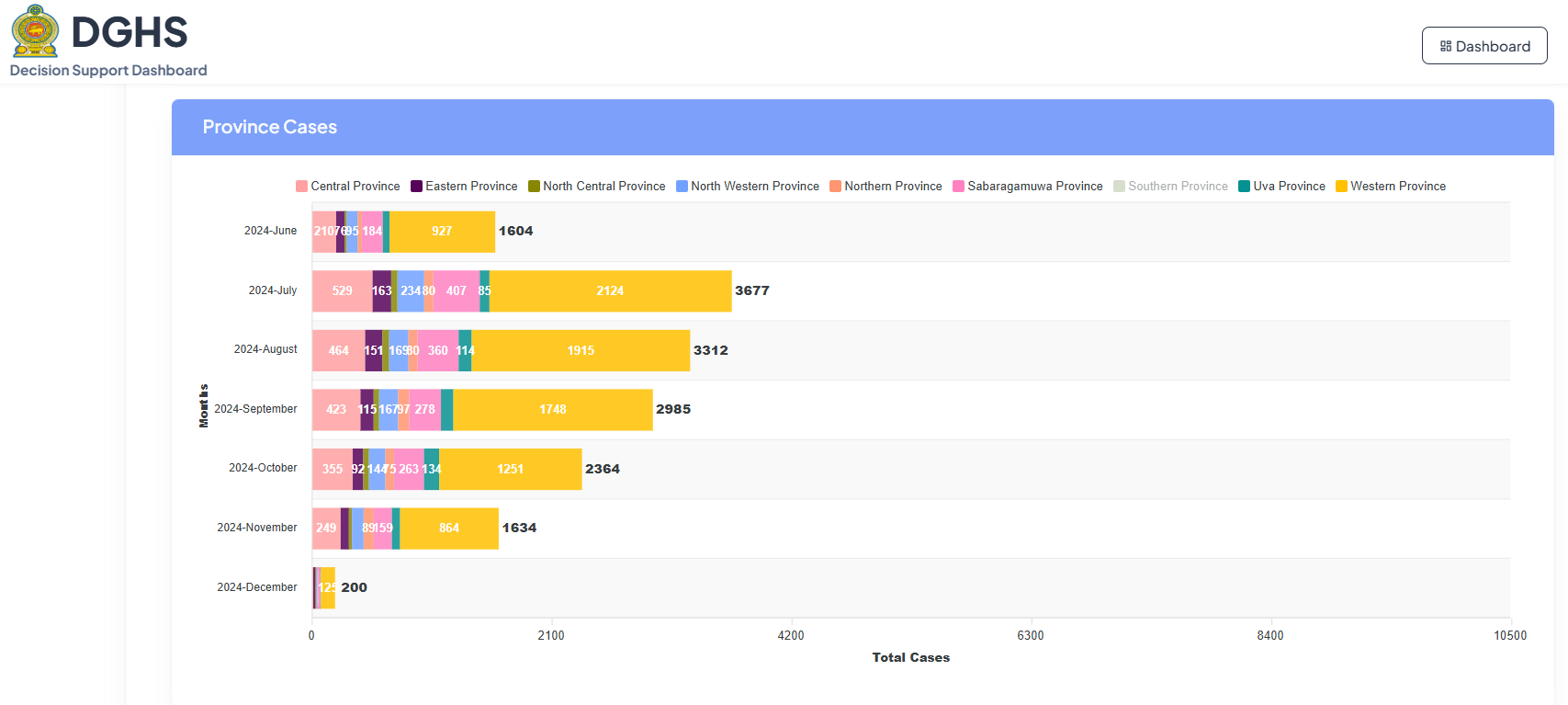
This dashboard provides a breakdown of dengue cases by province on each month of the year.
Key Performance Indicators (KPI)
- Monthly Cases: Each month of selected year is stacked vertically and the number of cases shown horizontally.
- Province Cases: When desired province is selected on top of the graph, it will stack according to each month. Any number of provinces could be selected for comparison.
The following diagram is shown as an example of how the diagram will look like when all nine provinces were selected
Type of Data Visualization
- The dashboard uses:
- Stacked Bar Chart: A stacked bar chart is the primary visualization. Each bar represents a month, and the segments within each bar represent the contribution of different provinces to the total cases for that month.
- Color-Coding: Each province is assigned a distinct color. A legend is provided to identify each province.
- X-axis: Represents the "Total Cases".
- Y-axis: Represents each month.
Purpose of the Visualization
- Track Provincial Trends: Monitor the distribution and trends of dengue cases across different provinces in each month.
- Identify High-Risk Provinces: Identify provinces with consistently higher case numbers.
- Compare Provincial Performance: Compare the dengue situation between provinces to understand regional variations.
Dengue Dashboard - Drill Down 3
This section will be accessed by scrolling down from the previous section.
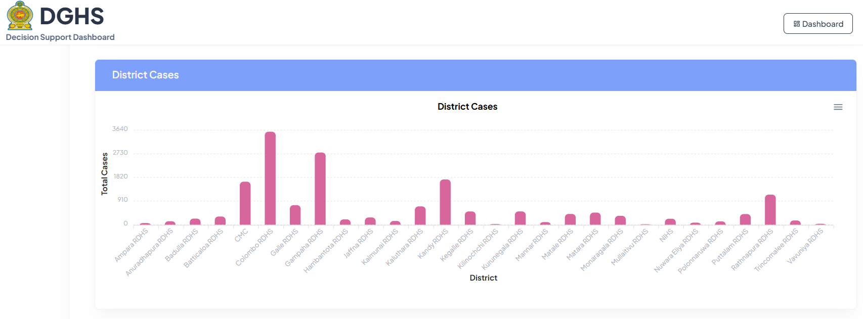
This dashboard shows the distribution of dengue cases across different health districts [Regional Directorate of Health Services (RDHS) areas].
Key Performance Indicators (KPI)
- District Cases: The main KPI is the number of dengue cases reported in each RDHS area.
Type of Data Visualization
- Bar Chart: A simple bar chart is used to represent the "District Cases." Each bar represents an RDHS, and the height of the bar corresponds to the number of dengue cases reported in that RDHS area.
- Color-Coding:
- Light green – number of cases
- X-axis: Represents the "District (RDHS area)"
- Y-axis: Represents the "Total Cases"
Purpose of the Visualization
- Compare District-Level Cases: Provide a clear and quick comparison of dengue case numbers across different RDHS areas.
- Identify High-Risk Districts: Easily identify RDHS areas with a significantly higher number of cases, indicating potential hotspots.
Dengue Dashboard – Drill Down 4
This section will be accessed by scrolling down from the previous section.
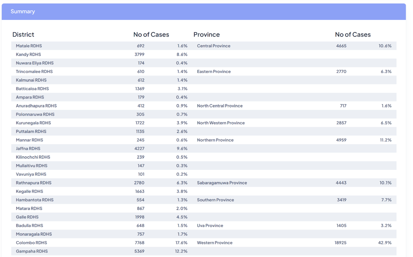
This dashboard presents a summary of dengue case data by RDHS area and province.
Key Performance Indicators (KPI)
- No of Cases (District): The number of dengue cases reported in each RDHS area.
- No of Cases (Province): The number of dengue cases reported in each province.
- % of Cases in District: % of dengue cases contributed by each RDHS area.
- % of Cases in Province: % of dengue cases contributed by each province.
Type of Data Visualization
- Table: A simple table is used to present the data. It's divided into two sections: one for districts (RDHS areas) and one for provinces.
- Columns: The table has columns for "District/Province," "No of Cases," and "%," showing the percentage contribution of each RDHS area/province to the overall total.
- Rows: Shows each RDHS area and each province.
Purpose of the Visualization
- Summarize Dengue Cases: Provide a concise summary of dengue case numbers at both the RDHS and province levels.
- Show Relative Contribution: Provide context by showing the percentage contribution of each RDHS/province to the total number of cases.
Dengue Dashboard - Drill Down 5
This section will be accessed by scrolling down from the previous section.
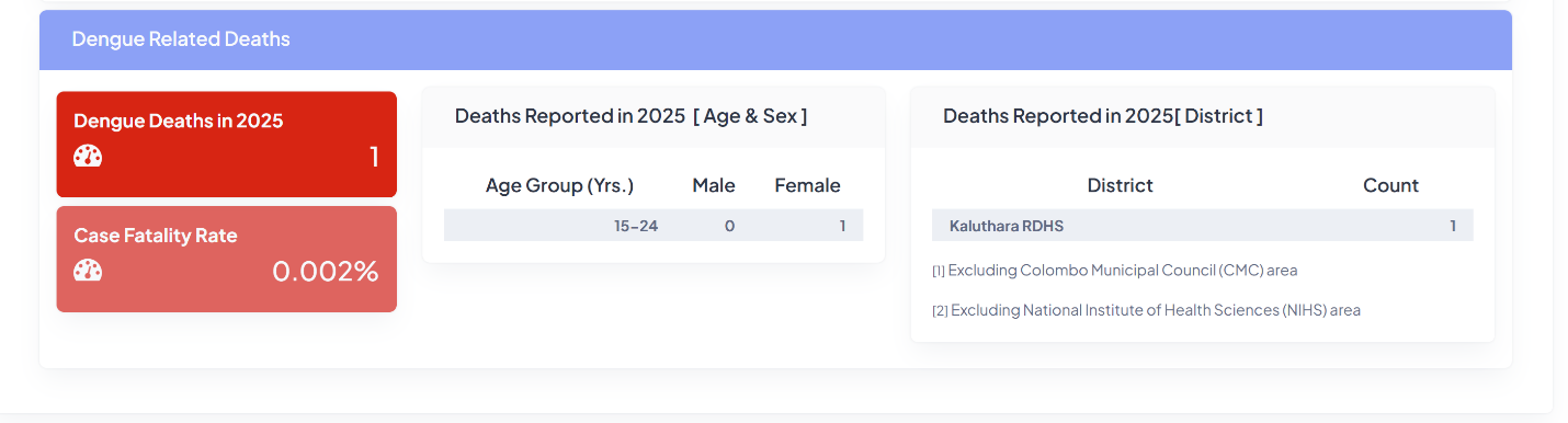
This dashboard provides an overview of dengue-related deaths.
Key Performance Indicators (KPI)
- Dengue Deaths in a year: The total number of deaths attributed to dengue in the year.
- Case Fatality Rate: The percentage of dengue deaths out of total number of cases over the period.
- Deaths Reported Age & Sex: A breakdown of dengue deaths by age group and sex.
- Deaths Reported by District: A breakdown of dengue deaths by RDHS area.
Type of Data Visualization
- Counts: Numerical displays for "Dengue Deaths in 2025" and "Case Fatality Rate."
- Tables: Two tables are used to present the breakdown of deaths by age and sex, and by RDHS area.
Purpose of the Visualization
- Monitor Dengue Mortality: Track the number of deaths caused by dengue.
- Assess Severity: Evaluate the severity of the dengue outbreak or treatment outcome using the case fatality rate.
- Identify Vulnerable Groups: Analyze the distribution of deaths by age and sex to identify potentially vulnerable populations.
- Track Geographic Distribution of Deaths: Monitor which RDHS areas are reporting dengue-related deaths.
SDG Landing Page
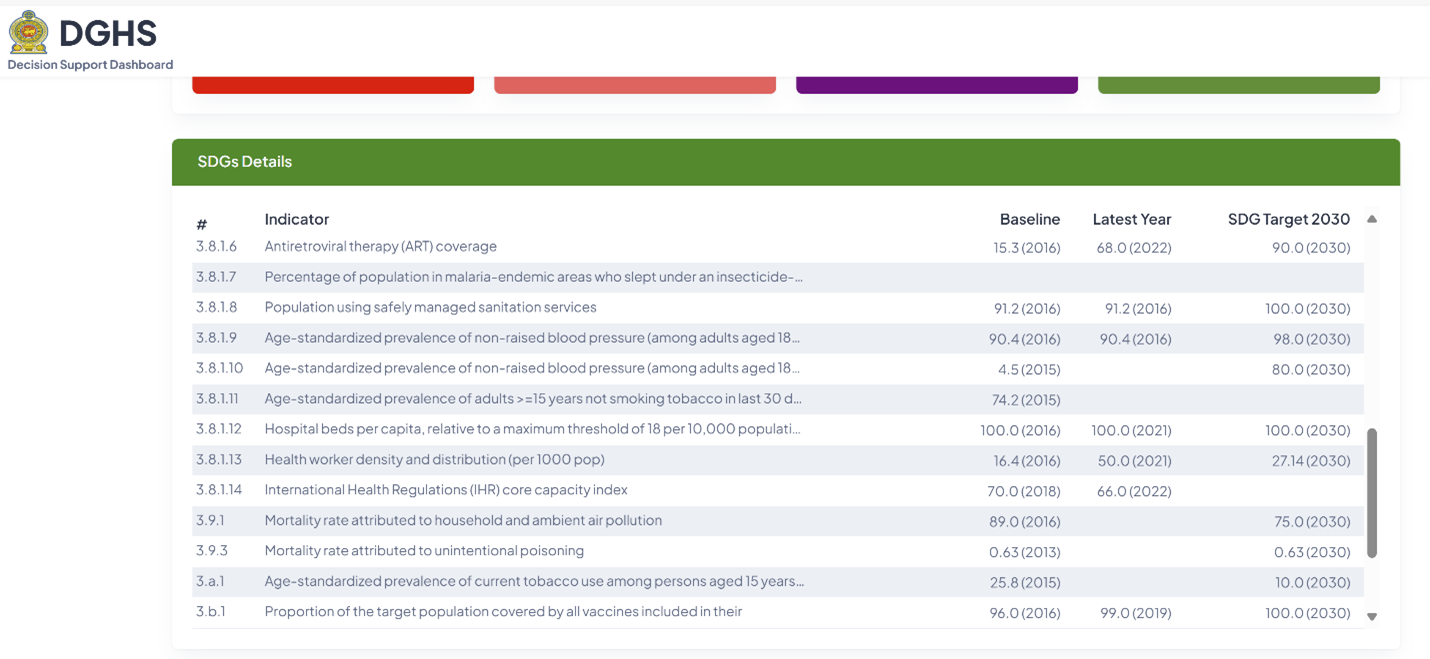
This dashboard is to track the progress towards Sustainable Development Goals (SDGs) related to health.
Key Performance Indicators (KPIs)
- The table presents a list of health-related specific SDG Indicators.
Data Source:
- Various Units of the Ministry of Health.
Type of Data Visualization
- The dashboard uses a table to present the SDG data.
- Rows: Each row represents a different health-related SDG Indicator.
- Columns: Columns include the SDG indicator number, the indicator name, the baseline value (with reported year), the latest year's value (with reported year), and the SDG target for 2030 (with target year).
Purpose of the Visualization
- This dashboard aims to:
- Track SDG Progress: Monitor progress towards achieving health-related Sustainable Development Goals.
Universal Health Coverage - Landing Page
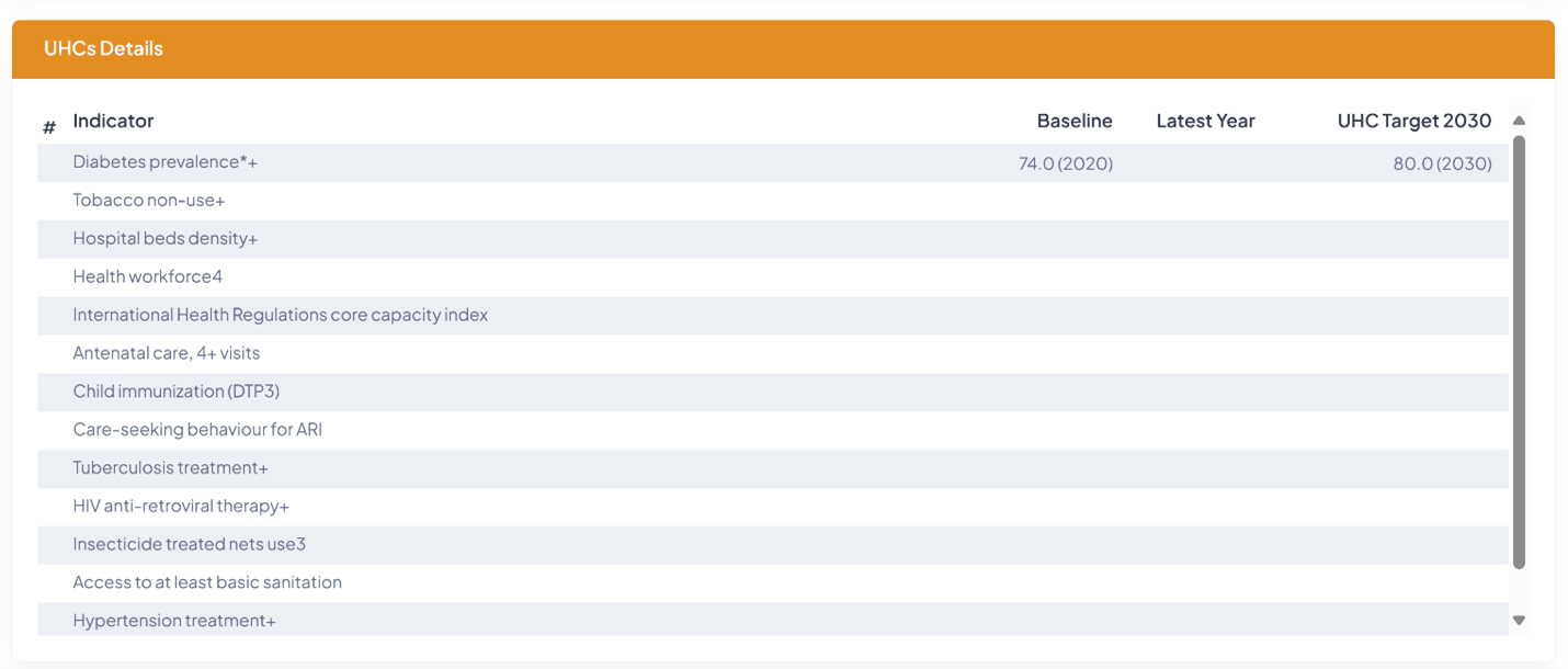
This dashboard is to track the progress towards Universal Health Coverage (UHC) targets.
Data Source:
- Various Units of the Ministry of Health.
Type of Data Visualization
- The dashboard uses a table to present the UHC information.
- Rows: Each row represents a different UHC indicator.
- Columns: Columns include the UHC indicator number, the indicator name, the baseline value (with reported year), the latest value (with reported year), and the UHC target for 2030.
Purpose of the Visualization
- Track UHC Progress: Monitor progress towards achieving Universal Health Coverage targets.
- Identify Areas of Improvement: Highlight areas where performance is lagging, and interventions are needed to meet UHC targets.
Standard Operating Procedure (SOP) for Data Providers
Introduction
- Purpose: These SOP are designed to give technical insight and procedures, instructions and responsibilities of the staff members who provide data and support services in order to smoothly run the DGHS Decisions-Support Dashboard.
- Scope: These SOP are specifically developed for the staff members who are directly uploading the data and are directly involved in supporting the DGHS Decision-Support Dashboard. Currently, the dashboard contains Medical Supplies, Dengue, Sustainable Development Goals (SDG) and Universal Health Coverage (UHC) information.
It is advisable for the data providers and technical support providers to read the Guidelines component of this document in order to understand the depth of the decision-making process they have been involved in and understand their crucial role that decisions on main health systems are taking place due to their support.
The DGHS Dashboard is a web application developed using Java technologies and MySQL Community Server. It serves as a centralized platform for monitoring key health indicators, including Daily Drug Availability in the Medical Supplies Division and Institutions, Dengue Patients Information, Universal Health Coverage (UHC), and Sustainable Development Goals (SDGs) related to health.
Medical Supplies Dashboard
Data Source:
- The dashboard communicates with the “Swastha” web application using REST API.
Automated Data Fetching:
- Data is fetched daily at 1:00 AM.
- The system attempts up to three retries if the data fetch request fails.
Manual Data Fetching:
- If automated fetching fails, the admin can manually fetch data via the dashboard interface and click on the Add/Edit button at the right top corner.
Procedure for Manual Fetching:
- Log in as an administrator.
Figure 1: Enabling data modification mode.
Figure 2: Enter the password of the admin user.
- Click on the ADMIN icon at the right top corner.
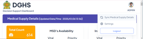
Figure 3: Accessing for admin user options.
- Click on "Sync Medical Supply Details"
- Verify the data after fetching to ensure accuracy.
Dengue Dashboard
Data Source:
- The complete data set is provided by the Director, Dengue Control Unit of Ministry of Health.
Procedure for Uploading Data:
- Once sign in to the system by pressing Add/Edit, click on the dengue data header bar showing the ‘More’ hyperlink.
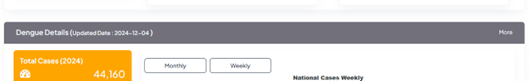
Figure 4: Invoking details of Dengue
The user will be directed to the Dengue details page which contains two file uploads.
- weekly case data
- daily case data
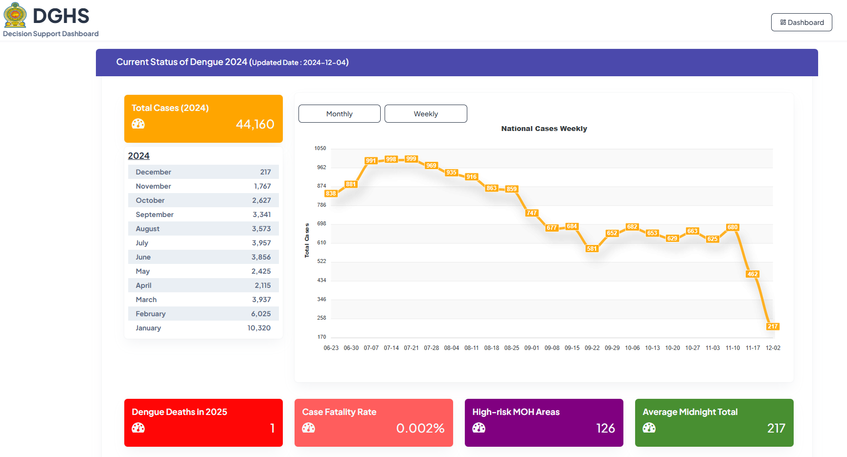
Figure 5: Dengue data file uploading procedure.
Data Upload Formats and time:
- The daily data should be updated daily at 10 pm each day.
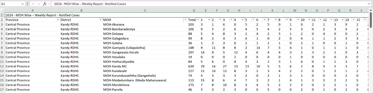
- The daily data should be uploaded in following format in Microsoft Excel
- The weekly data should be updated every Sunday at 10 pm each week.
- The weekly data should be uploaded in following format in Microsoft Excel
Dengue Deaths Entry:
- Death data is entered directly using a web form provided on the dashboard. The officer who enters the data needs to sign in and enter the data.
Universal Health Coverage (UHC)
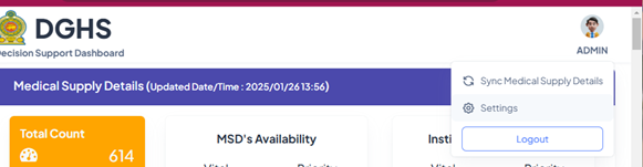
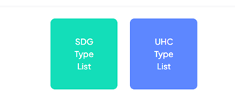
Figure 6: Invoking data editing for UHC and SDGs
Data Sources:
- UHC indicators are provided by different divisions/units of the Ministry of Health. These information should be collected by the Medical Officer in-charge for the DGHS Dashboard and entered into dashboard system as instructions provided below.
- Data is entered through web forms provided on the dashboard.
Data Entry Procedure:
- Log in to the dashboard.
- Navigate to the "Universal Health Coverage" section.
- Fill in the required fields in the web form.
- Validate the data for accuracy before submission.
Sustainable Development Goals (SDG) Related to Health
Data Sources:
- SDG indicators are provided by different divisions/units of the Ministry of Health. These information should be collected by the Medical Officer in-charge for the DGHS Dashboard and entered into dashboard system as instructions provided below.
- Data is entered through web forms.
Data Entry Procedure:
- Log in to the dashboard.
- Navigate to the "Sustainable Development Goals" section.
- Fill in the required details in the web form.
- Validate and verify the data before submission.
Maintenance and Troubleshooting
- Ensure the Java and MySQL versions are compatible with the deployed version.
- Disk space should be monitored because of the automated data backup procedure.